Row of glowing casino slot machines on the gaming floor, representing the on-machine service window players use to fund play
Case Study: Embedded UX / Gaming Hardware

Redesigning Cashless Funding for IGT's Casino Floor
20%
Increase in cashless usage after redesign
Lower
Cognitive load after the redesign, from a fragmented layout to a clear hierarchy
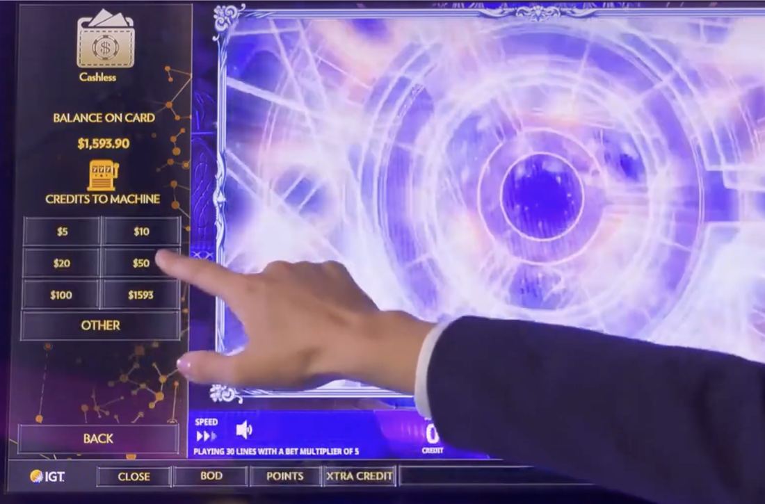
A player's hand funding a slot machine directly from the cashless service window, with balance on card, credits to machine, and quick-amount buttons visible

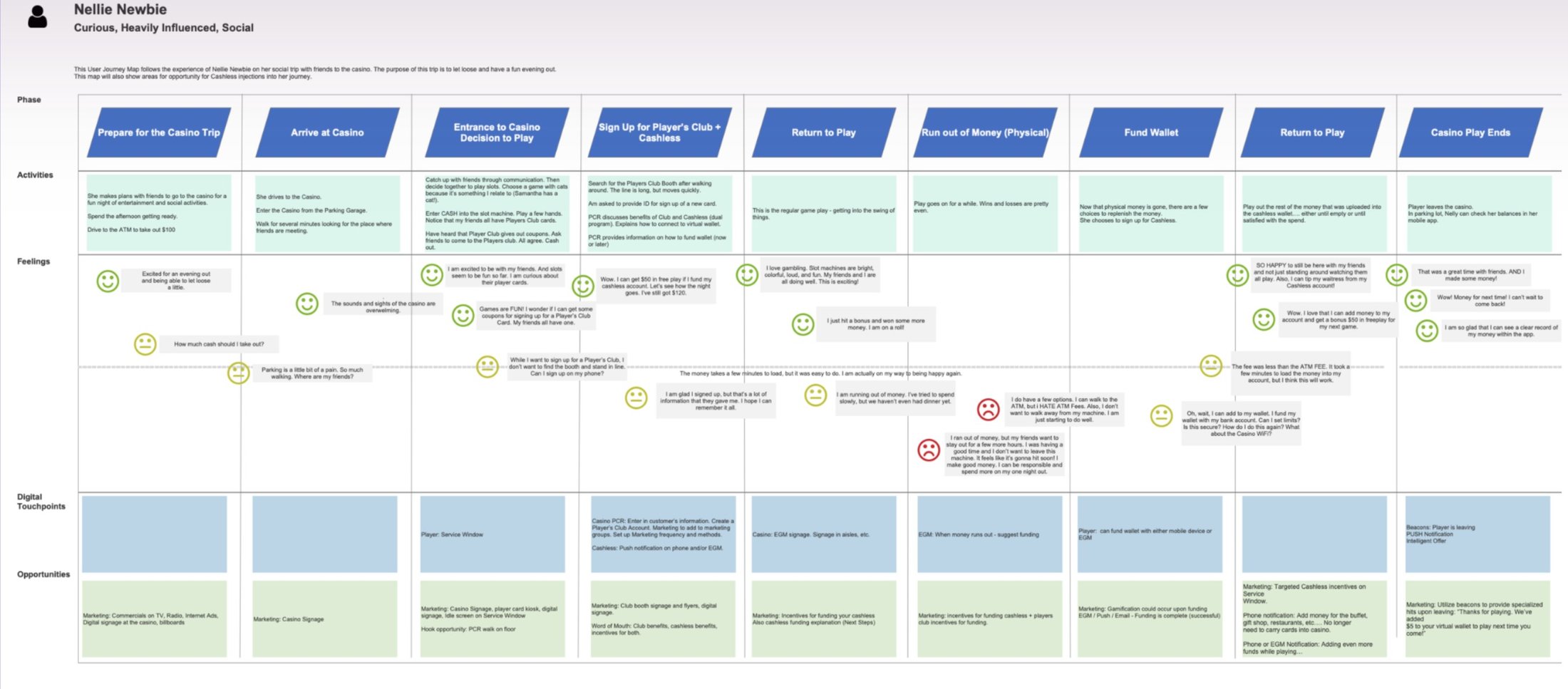
On casino floor journey maps, the steepest drop in player sentiment isn't at check-in or sign-up. It's the moment a player runs out of credit mid-session and has to decide: walk to an ATM that charges five to thirty dollars a transaction, or risk losing a hot machine to someone else. That single moment, running out of money, is what this redesign set out to fix.

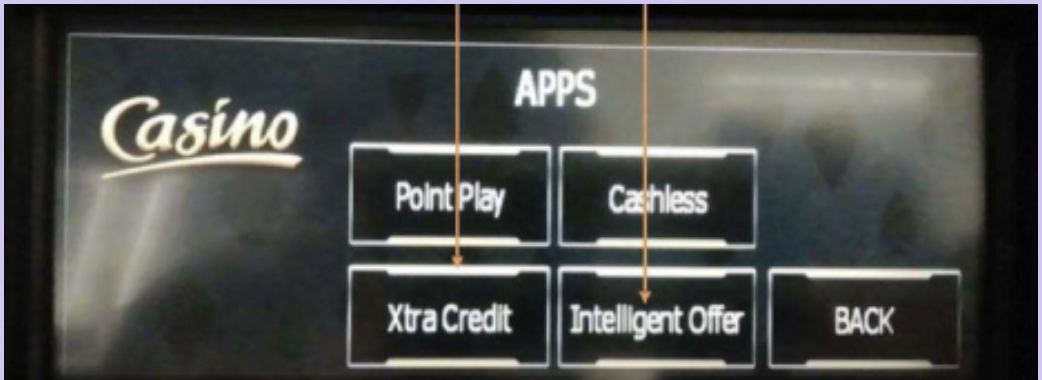
This case study is about redesigning that alternative inside the service window: a cashless option already lived in every machine's on-screen menu, mixed in with point play, xtra credit, and other apps, too fragmented and confusing for most players to trust. The fix had to live on that same small, fixed, regulated screen, bolted to hardware I could not redesign: the one wall everything below had to work inside.
RoleSenior User Experience Designer & Product Designer
CompanyHCL Technologies
ClientIGT
Team1 junior UX designer, 8 developers
Duration1 year (2020–2021)

My Role

HCL Technologies staffed me on a dedicated engagement with IGT, where I led UX research, strategy, and design for the cashless funding flow on the service window, the primary player-facing screen covered in this case study.

That work sat inside a larger cashless initiative at IGT, which also included a casino operations platform for floor staff and an internal support platform for technical teams; I contributed to both, and mention them briefly later on for context, but the flows, testing, and outcomes described here are about the player-facing service window.

I had a junior UX designer and a development team of eight on this. Product, engineering, compliance, marketing research, casino partners, and internal support all weighed in too, which kept UX decisions lined up with the business and technical constraints we were working inside.

Focus: Cashless Funding on Slot Machines · Tools: Adobe XD, LucidChart, Google Analytics, Open Sans, HTML5 · Accessibility: Designed for dexterity & casino-floor visibility

Leaving the machine to get cash was the problem, and the machine itself was the one thing I couldn't change.

A cashless option already existed on the service window, but it was buried inside a fragmented apps menu. It was confusing enough that many players skipped it and left their machine for an on-property ATM charging five to thirty dollars a transaction anyway: a cost to casinos in lost revenue, and a cost to players in cut-short sessions.

Fixing it wasn't a matter of adding a button. Any fix had to work inside a small, fixed, white-label screen bolted to hardware I couldn't redesign, under financial compliance rules and gaming regulations that vary by jurisdiction.

Player Experience

ATM fees and long lines delayed or discouraged funding. Many players left to find a cheaper machine, or ended sessions early, cutting play time and engagement.

Casino & Business Impact

Long ATM queues and floor congestion cost casinos revenue and visibility into player behavior. Cutting that friction only paid off if players trusted the replacement as much as they trusted cash in hand.

What the Hardware Allowed

  • A white-label product: the same interface had to work under many different casino brands, not just IGT's own
  • A small, fixed physical screen: no responsive layout, no extra room to add clarity
  • Existing machine hardware and touch input, which I could not redesign alongside the software
  • Tested vertical, horizontal, and custom screen configurations to find what actually worked for smooth interaction
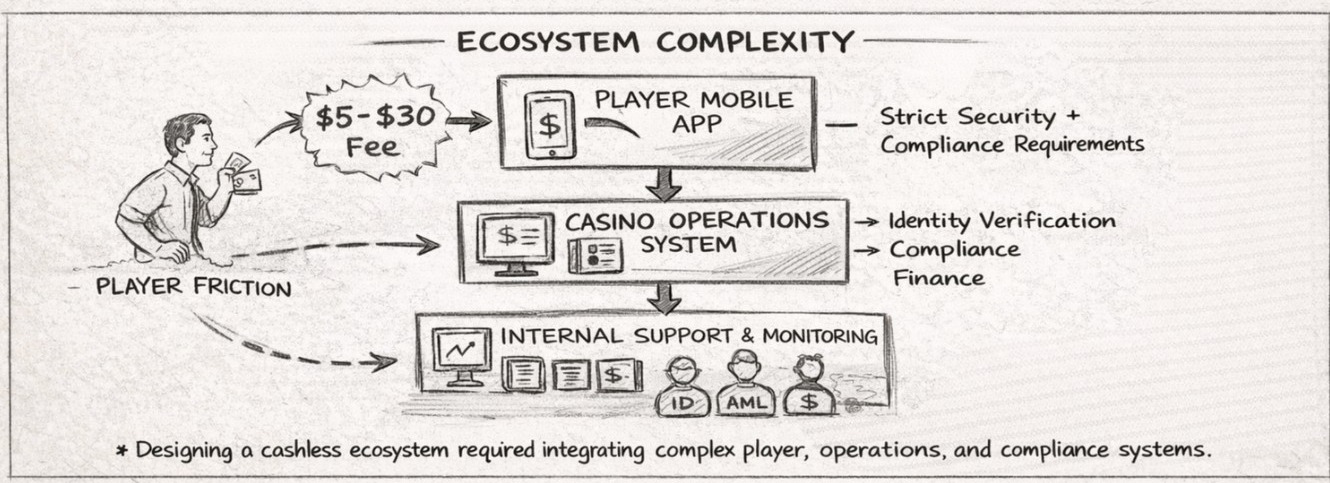
Ecosystem complexity map showing player friction flowing into the player mobile app, then the casino operations system, then internal support and monitoring, each with its own security, compliance, and verification requirements

The three separate systems (player app, casino operations, internal support) any cashless solution had to integrate, each with its own security and compliance requirements.

A year of player behavior, before any screens

Because the hardware was fixed and every change went through a regulatory review cycle, there was little room to learn by iterating on-device. I partnered with IGT's marketing research team to analyze over a year of qualitative and quantitative data, synthesized into core player personas grounded in real behavior, not assumptions. The research had to do the work the constraint wouldn't let screens do.

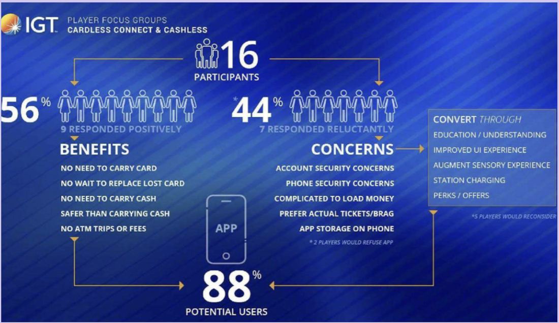
Surveys Focus groups In-person & remote interviews Stakeholder workshops
56%
Responded positively: no card, no cash, no ATM trips
44%
Responded reluctantly, mainly over account security

What players liked

  • No need to carry a card or cash
  • No wait to replace a lost card
  • Safer than carrying cash on the floor
  • No ATM trips or fees

What worried them

  • Account and phone security
  • Loading money felt complicated
  • Some preferred a physical ticket to hold onto
  • Storing an app on their personal phone
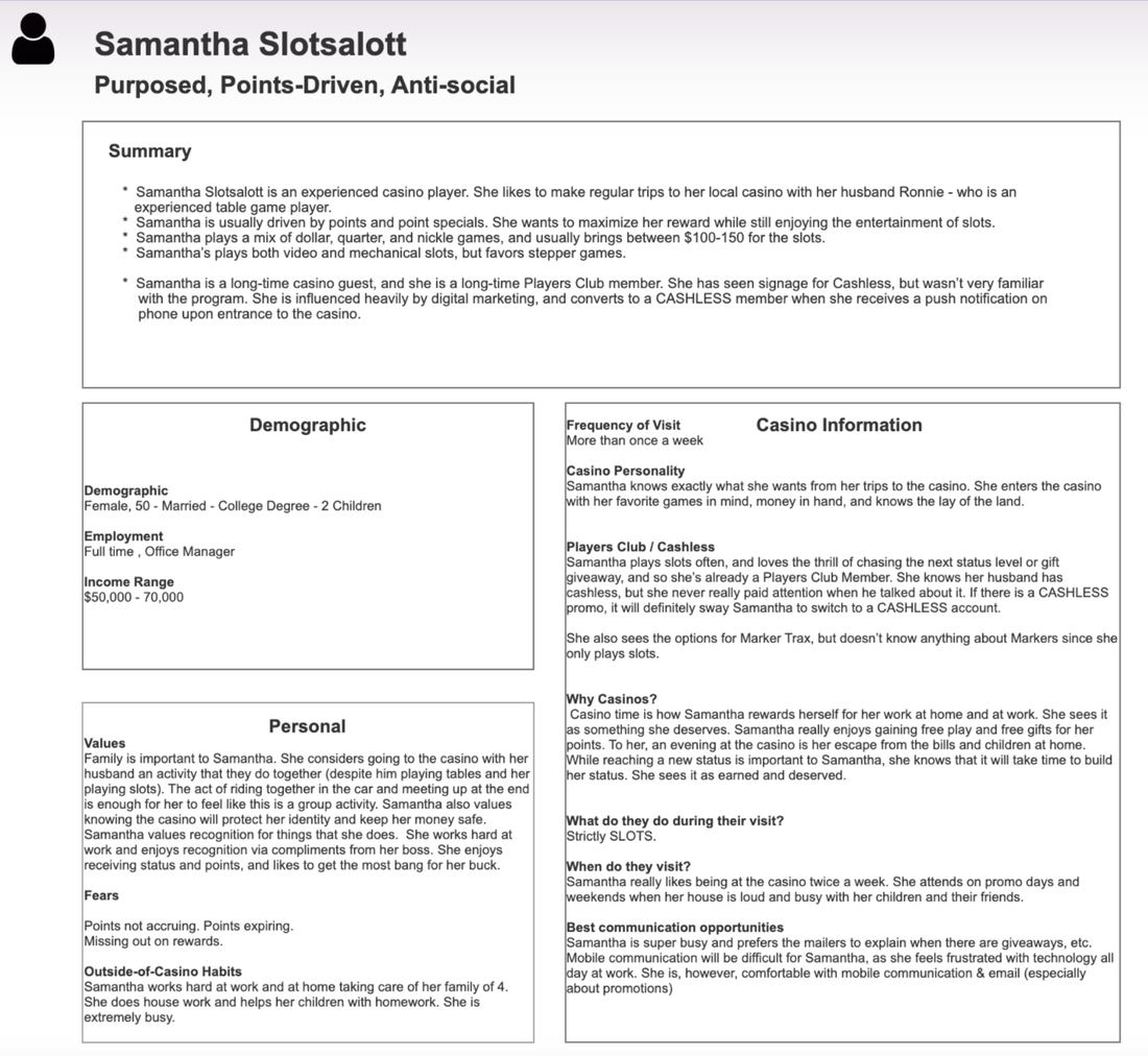
Research persona: Samantha, a purpose-driven, points-driven, and reserved player

One of the core player personas built from this research (internal shorthand name), kept here as evidence of the process rather than a polished deliverable.

IGT player focus group results for cardless connect and cashless: participant breakdown, benefits, and concerns

The original focus group readout: the source data behind the stats above.

One flow, four different systems underneath it

Using real player flows and direct quotes, I mapped the end-to-end journey across every system a single funding action touches: player experience, casino floor operations, technical support, and compliance reporting.

Nellie Newbie user journey map: prepare for the casino trip, arrive at casino, entrance and decision to play, sign up for player's club and cashless, return to play, run out of money, fund wallet, return to play, casino play ends, tracked across activities, feelings, digital touchpoints, and opportunities

The full map, following "Nellie Newbie" start to finish. The steepest drop in feeling doesn't happen at arrival or sign-up: it happens at "Run out of Money," the only stretch with openly negative reactions, driven by ATM fees and the fear of losing a hot machine to a cash run. Nearly every opportunity flagged on the map clusters right there, which is exactly where cashless funding needed to step in.

What early testing actually found

On hardware I couldn't patch overnight, a broken flow on the casino floor cost real players and real revenue.

That raised the stakes of testing itself. I partnered with live casino properties to test cashless prototypes with real paying customers on the floor: account creation, machine pairing, wallet funding, cash-in and cash-out, error handling, and support flows. These early findings are what shaped the redesign priorities below.

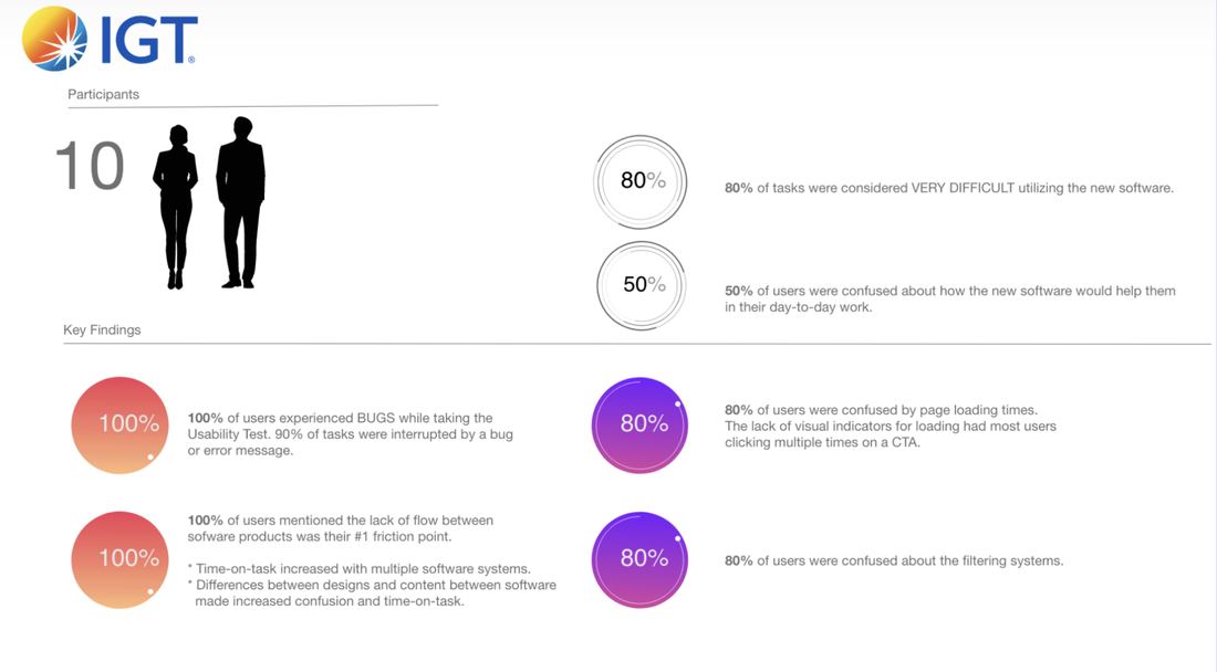
10
Participants in live, on-floor usability testing
80%
Found tasks very difficult on the early software
100%
Experienced a bug; 90% of tasks were interrupted by one
80%
Confused by loading times with no visual feedback

Key insight: the software, not the hardware, was the loudest complaint. 100% of participants named the lack of flow between different software products as their single biggest friction point, and half weren't clear on how the new software actually helped their day-to-day work. Filtering confused 80%.

Separately, inconsistent casino connectivity affected transaction speed and pairing reliability, which led to parallel infrastructure work with casino IT teams, alongside the interface changes below.

IGT usability testing key findings: participants, task difficulty, bugs, and flow friction

The original usability testing readout: the source data behind the stats above.

Simplifying a screen most designers never see

With no room to add screen real estate and no fast iteration cycle, every simplification had to earn its place. Based on research, journey mapping, and live testing, I focused on reducing cognitive load and building trust into the highest-risk transactional moments on the service window, all within the same fixed screen the whole project was constrained to.

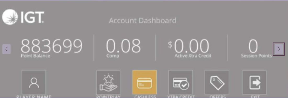
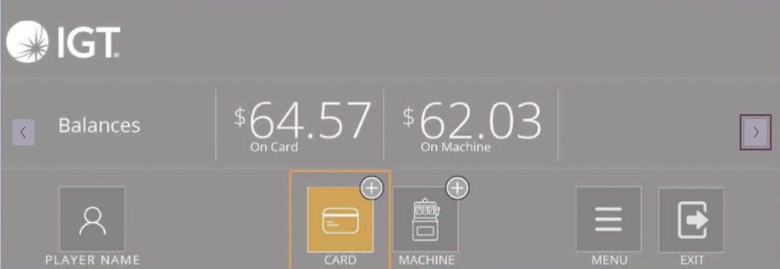
Three changes trace directly back to testing: I replaced the fragmented apps menu that drove the number-one complaint about lack of flow with a unified account dashboard; I split balances clearly between card and machine, addressing the "loading money feels complicated" confusion research had already flagged; and I added an explicit progress indicator for the 80% confused by loading times with no visual feedback.

An assumption I had to reverse: screen orientation. The early redesign rounds ran horizontal. Retesting them with more players and stakeholders with different needs, people had a hard time even locating the cashless option in that orientation: it got lost on the physical machine, not just on the screen. That evidence was what pointed to changing the layout approach to vertical, which is what shipped.
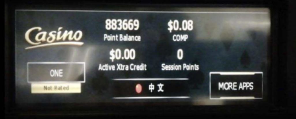
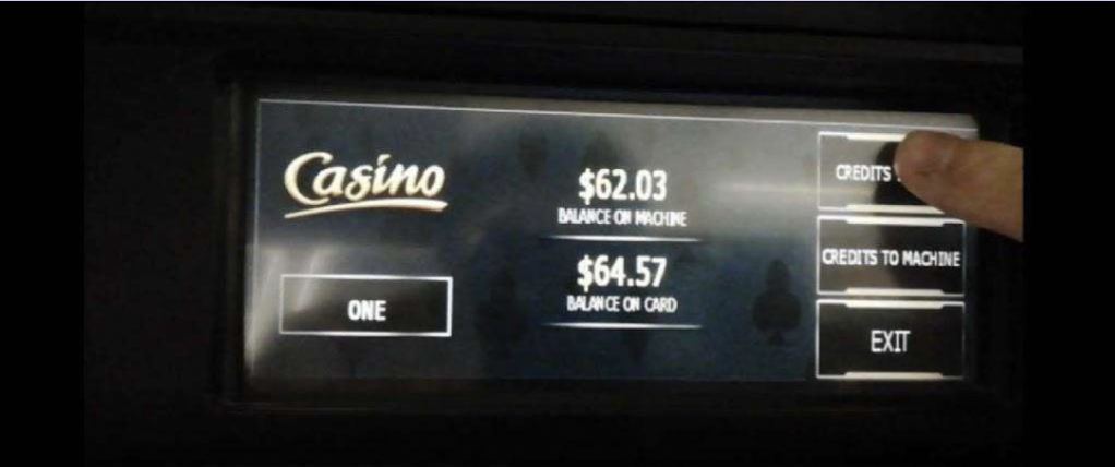
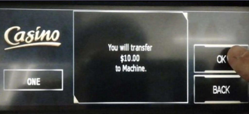
Before: fragmented layout, unclear money movement, high cognitive load
Old service window: apps menu with point play, cashless, xtra credit, intelligent offer
Apps menu
Old service window: point balance and active xtra credit screen
Point balance
Old service window: balance on card and machine, exit option
Balances
Old service window: confirmation to transfer funds to machine
Transfer confirm
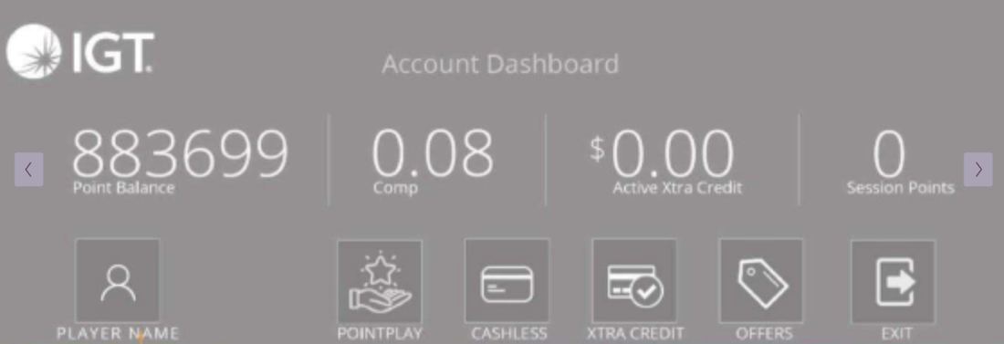
After: clear hierarchy, simplified flows, confidence-driven interactions
New service window: account dashboard with point balance and quick actions
Account dashboard
New service window: account dashboard with cashless action highlighted
Cashless action
New service window: balances split between card and machine
Card vs. machine
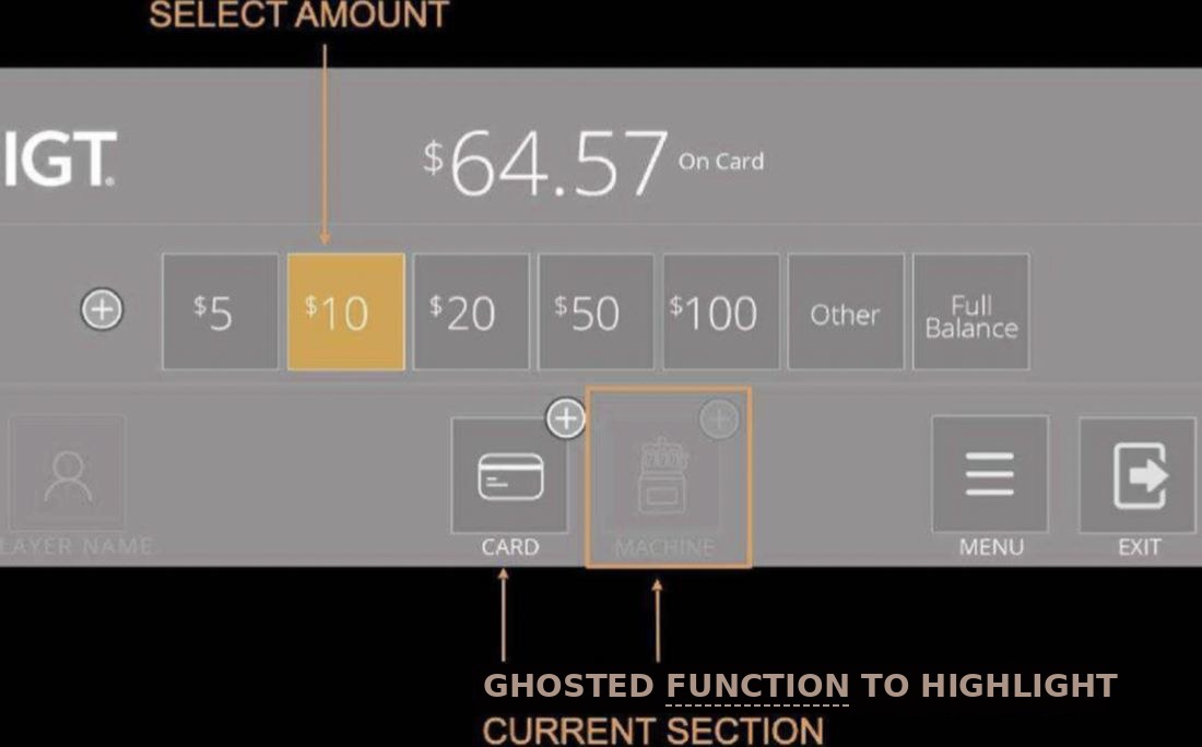
New service window: select funding amount screen
Select amount
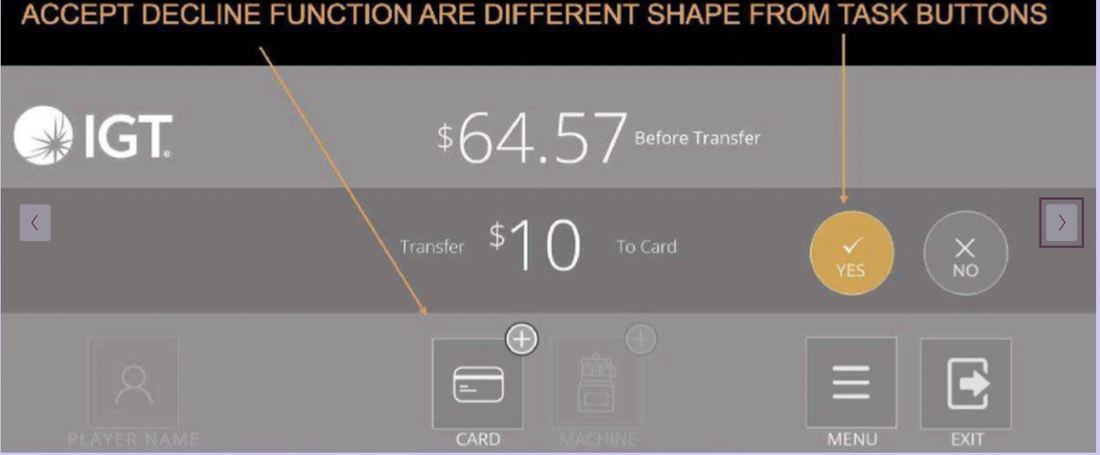
New service window: accept or decline transfer confirmation
Confirm transfer
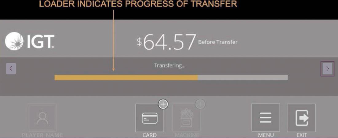
New service window: loading indicator showing transfer progress
Transfer progress

These screens weren't the end of it. Adoption data afterward showed I'd gotten the risk wrong: players weren't holding back mainly over speed, but over the PIN and password steps feeling like too much friction to trust blindly, and over the service window giving no clear confirmation once a transfer went through, so players couldn't tell if their money had actually moved.

More iterations followed to rework both; I no longer have access to those later files.

Speed versus trust, on a machine bolted to a casino floor

One stakeholder wanted instant auto-load: tap to fund, no PIN, no confirmation screen. Casino operations said no outright: compliance doesn't bend on a machine moving real money.

My own first build leaned too far the other way. Testing showed some of my confirmation steps added friction without adding trust. What shipped split the difference: instant where nothing was at risk, a PIN where it was, built into IGT's existing app instead of a new one players had no reason to trust yet.

Accessibility mattered here too: casino players skew older and more varied in dexterity than a typical mobile app audience, and the service window is fixed at one height and angle, glanced at mid-game rather than studied. That led to a few concrete calls:

  • Touch targets sized well beyond standard mobile guidelines, with primary actions spaced apart to prevent accidental taps from less steady hands
  • No swipe-to-confirm, no small drag handles: every action was a single, direct tap, so a player could fund and return to play without breaking focus
  • High-contrast color, larger type, and at-a-glance confirmations, for a screen viewed under casino lighting without the player looking away from the reels
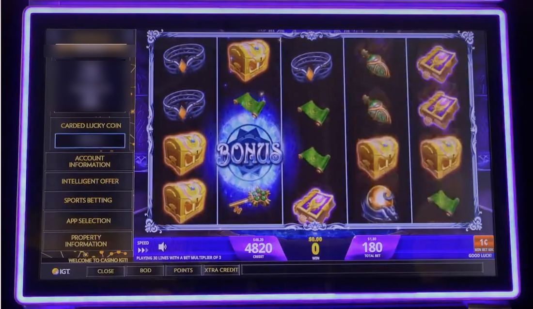
The shipped machine: a bonus round in progress, with the vertical cashless service window and account balance visible on the left edge of the screen

What actually shipped, after the orientation reversal, the risk miscall, and the speed-vs-trust negotiation above: the vertical service window, with balance and account status visible, without pulling the player out of the game. (Click to zoom)

20% increase in cashless usage.

Simplifying the highest-risk transactional flow, and building trust into every step, turned a feature players were reluctant to try into IGT's most successful on-demand product for this hardware category.

Measured with Google Analytics, comparing service window drop-off and cashless usage rates from before the redesign shipped (2019 into early 2020) against usage in late 2021, after the redesign had been live across casino properties.

Clearer
Distinct, trusted player interactions on the machine
Lower
Cognitive load, from a fragmented layout to clear hierarchy and simplified flows
Coherent
Stronger consistency across three connected platforms
Hardware I couldn't redesign, and compliance rules that shift state by state, shaped this project more than any single screen did. Earning a player's trust in a few taps, inside those limits, was the real job.
Next case study
Hey! Banco