NAMM (the National Association of Music Merchants) runs the NAMM Show, a major annual trade show. Exhibitors reserve booth space, sponsorships, and add-ons through a purchase flow on namm.org — the redesign covered here.
I led UX/UI research and design for NAMM's exhibitor booth purchase flow — auditing the live site screen by screen, then redesigning booth selection, sponsorship, enhancements, and checkout across desktop and mobile.
I worked closely with NAMM's in-house graphic and visual design team to carry their brand into the redesigned interface, alongside three developers, a product manager, two stakeholders, and a product owner over ten months.
Exhibitor access was restricted by NAMM's vendor agreements, so I led with what I could control directly: a full screen-by-screen audit of the live site and a competitive teardown of how comparable trade shows solved the same problem. Usability findings from NAMM's product owner rounded out the picture.
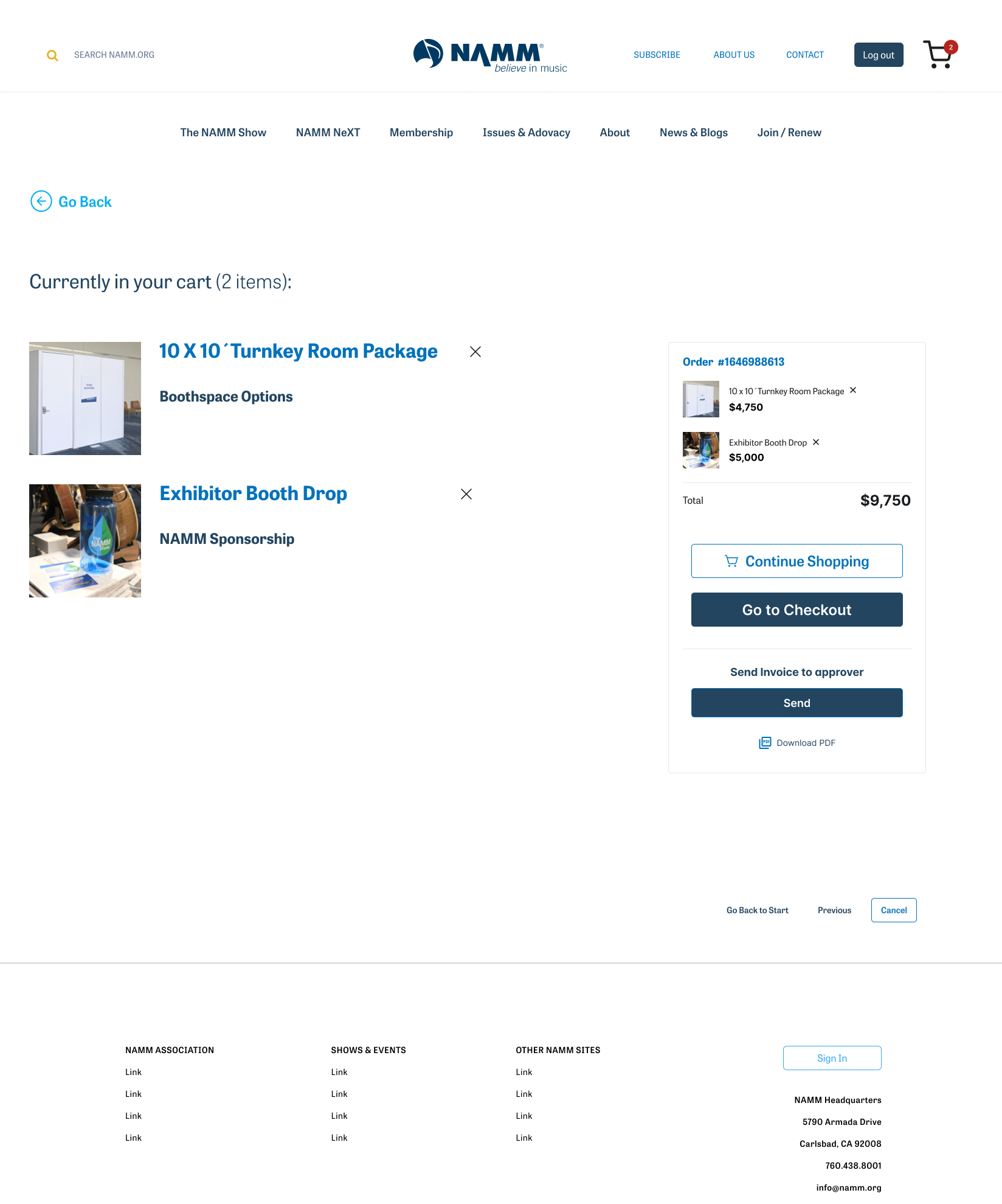
Amazon's e-commerce patterns — cart behavior, product detail pages, live pricing — shaped the interaction model directly, translated onto a booth-and-sponsorship flow with variable, build-your-own pricing instead of a fixed retail cart.
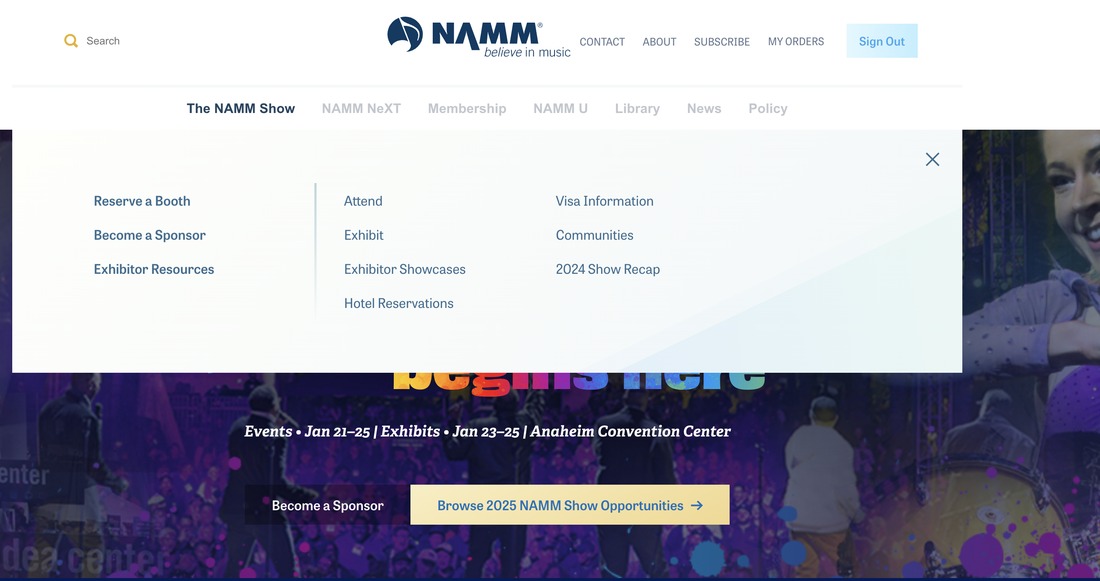
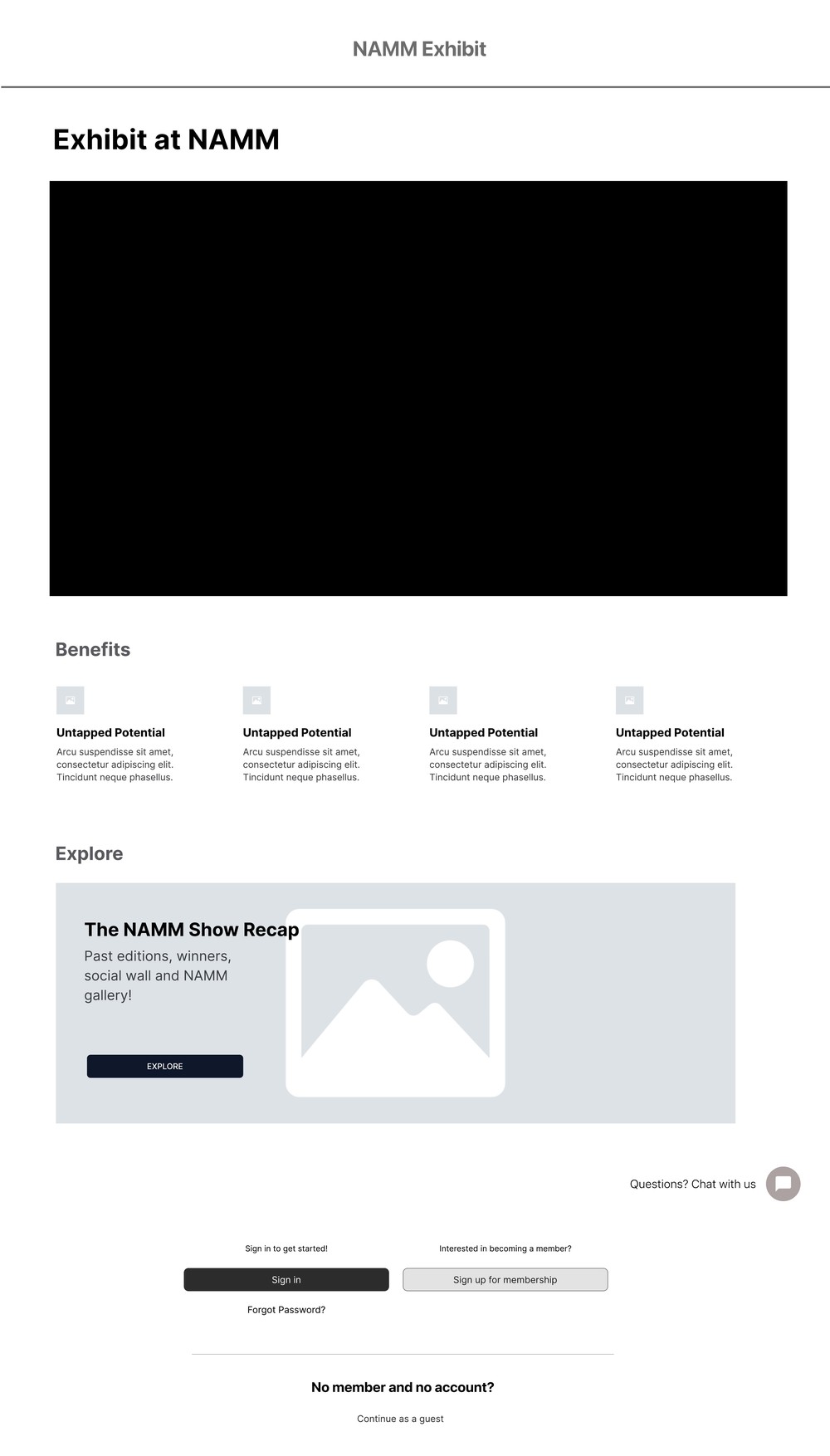
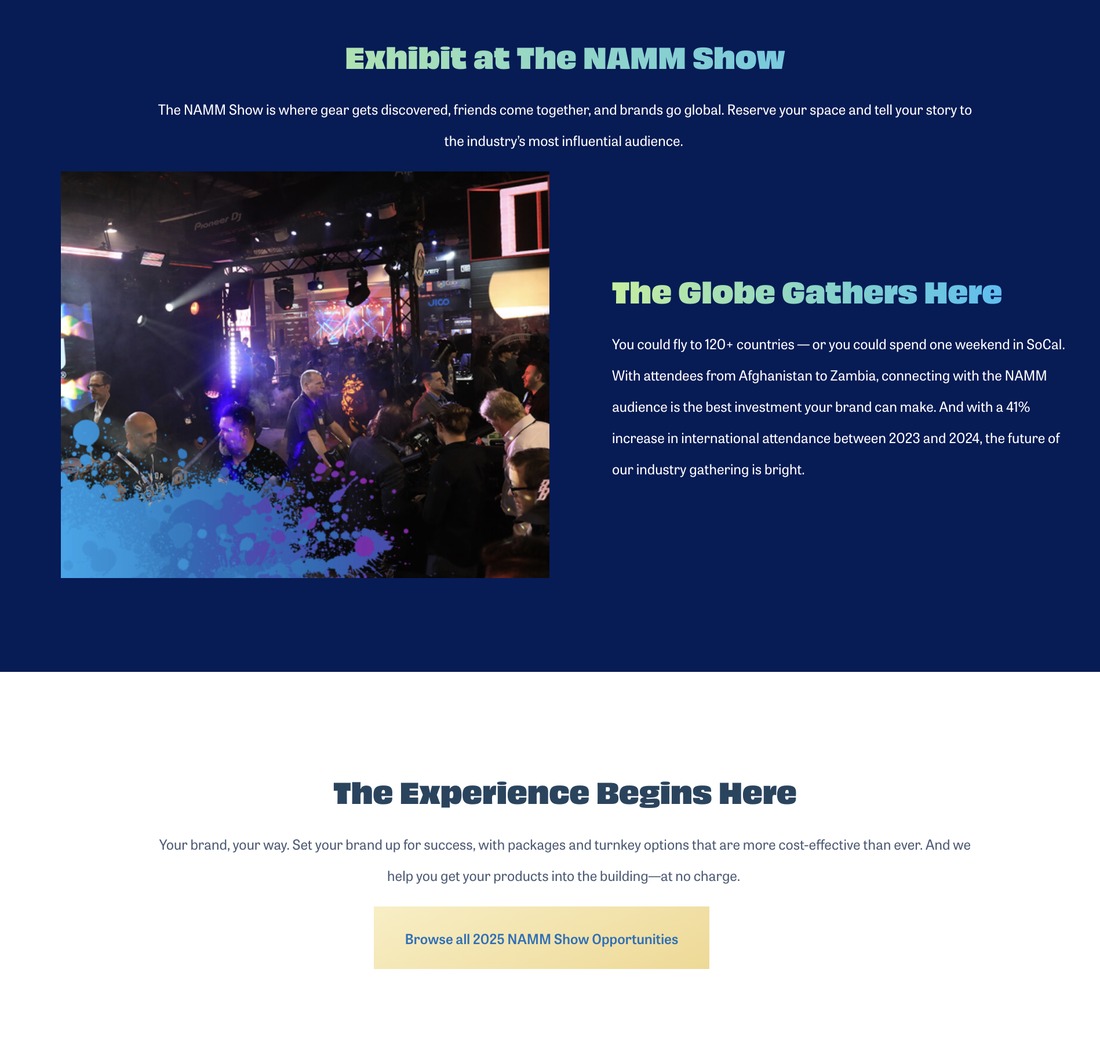
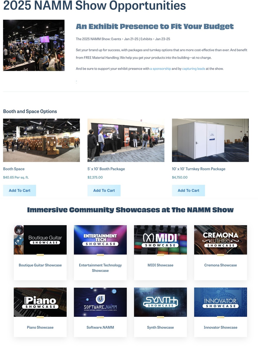
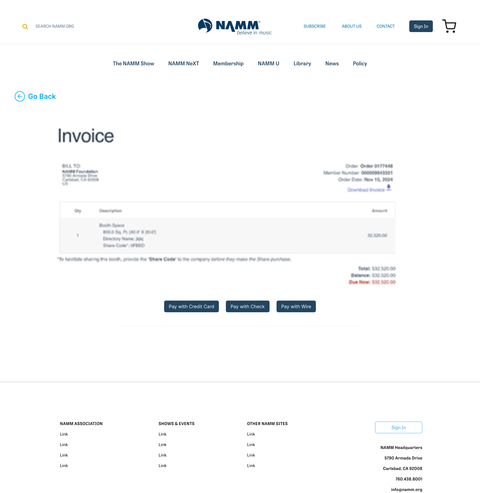
Rather than starting from a blank canvas, I went through the live exhibitor flow screen by screen and documented exactly what broke down. Three problems stood out.
"Reserve a Booth" and "Exhibit" sat in different columns of the same menu, with no sign they led to one process.
Exhibitors saw the membership requirement before investing any time in the form — instead of discovering it was required after they'd already started.
Generic copy, a broken video placeholder, and a CTA that just repeated the header button.
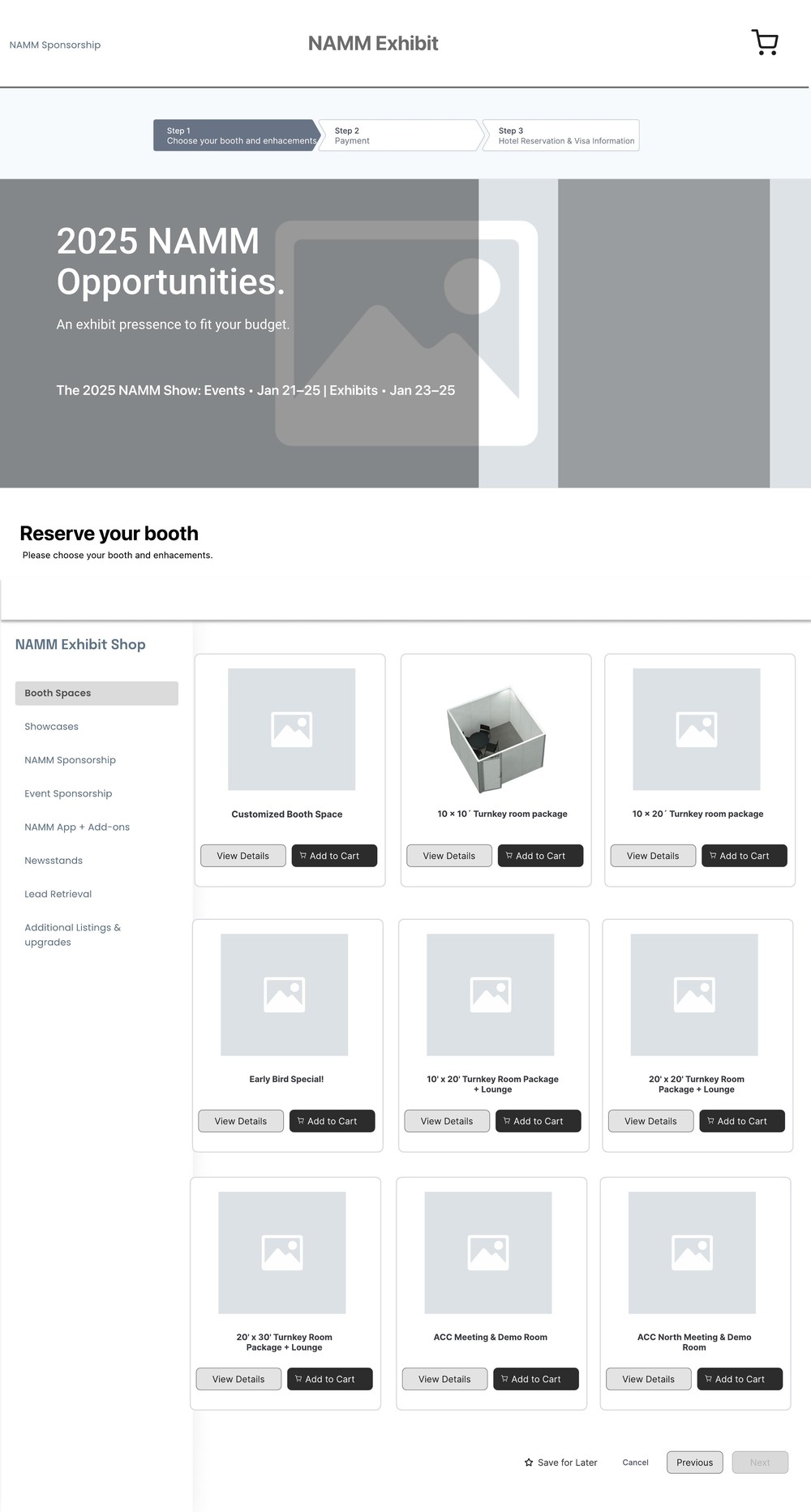
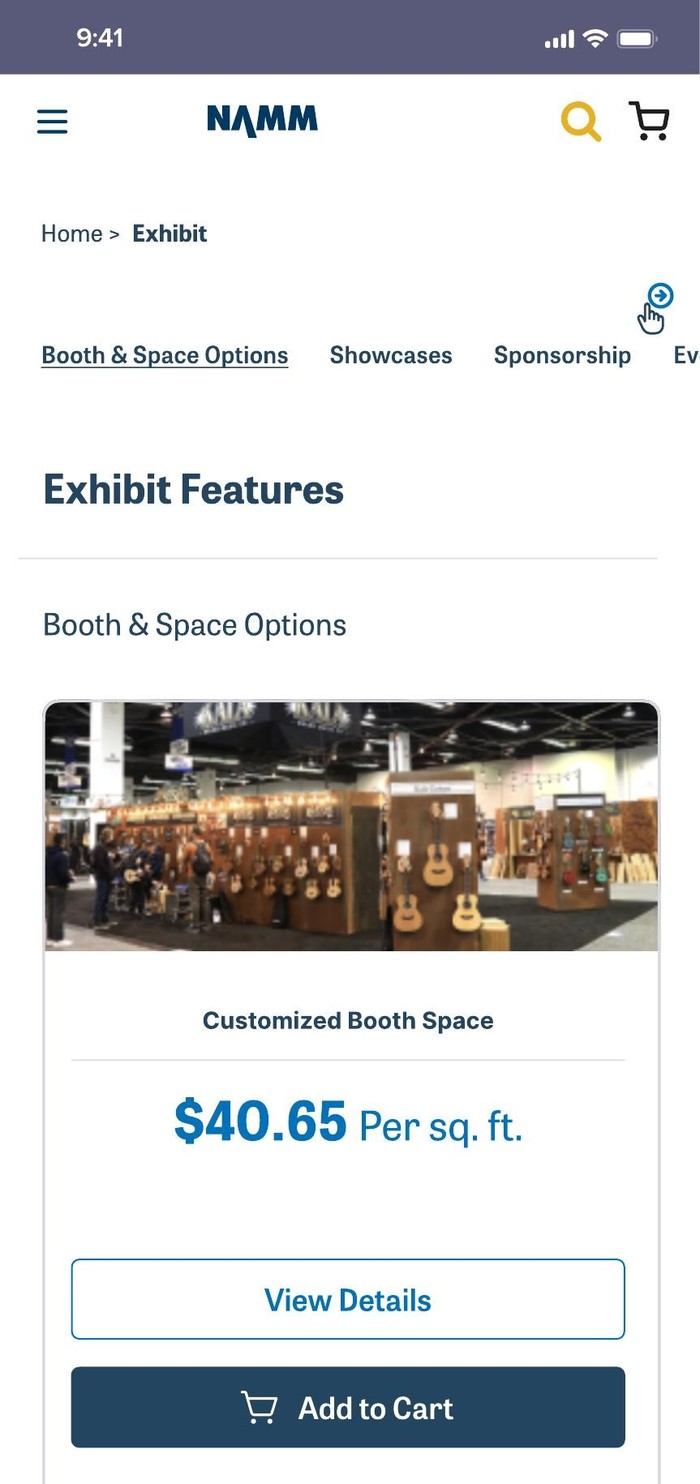
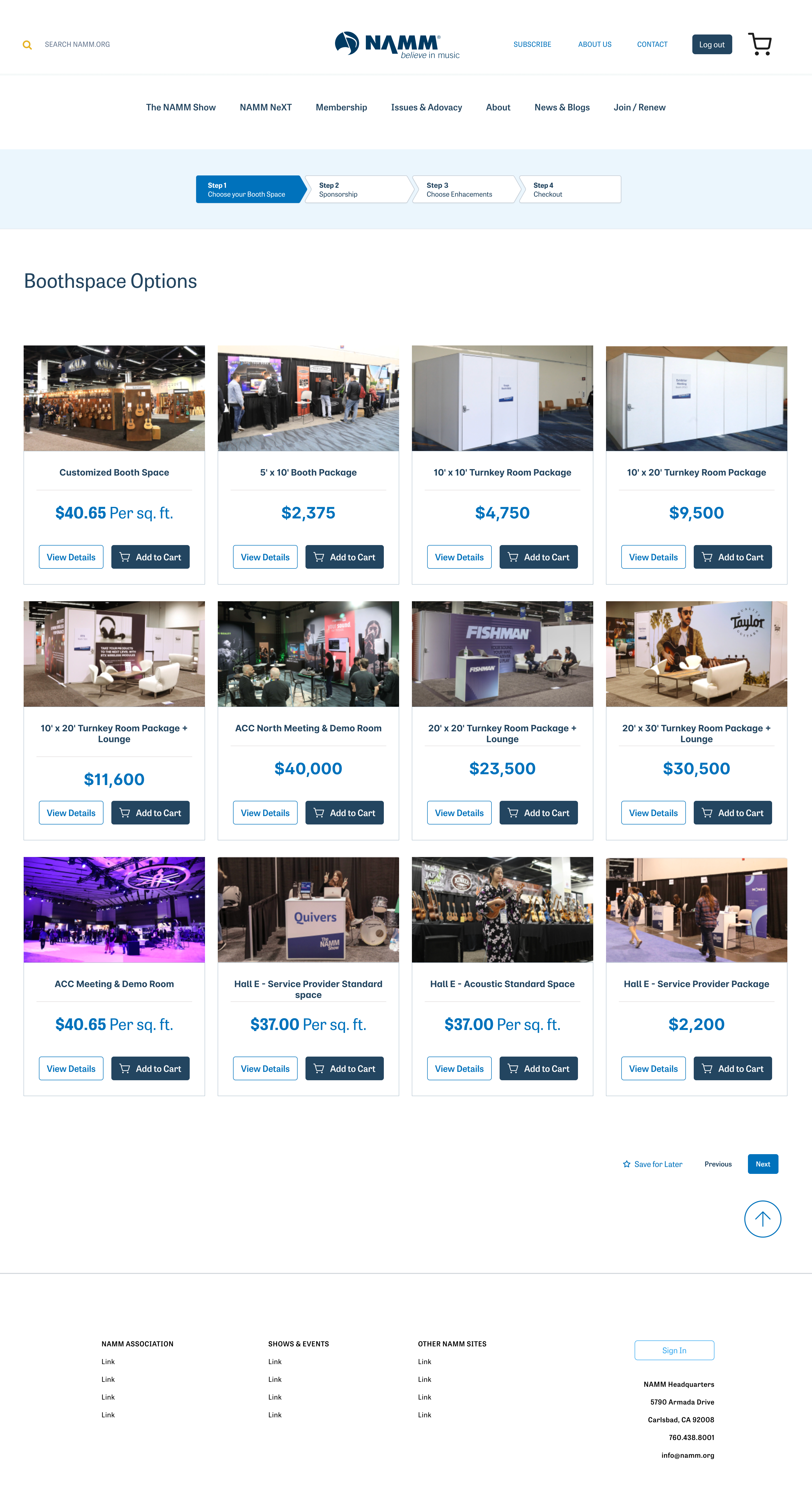
Every booth option sat in front of the exhibitor on one page, so no one had to leave, hunt for pricing elsewhere, and lose their place before deciding.
Both lived on one long page — booth options presented before the showcase choice that was supposed to come first.
Booths, showcases, and sponsorship each had their own place, so exhibitors weren't scrolling past irrelevant content to find the option they actually needed.
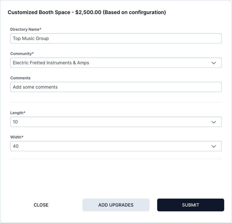
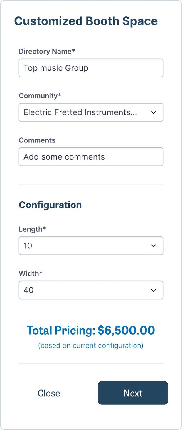
The Customized Booth Space option couldn't use a fixed price — cost depends on the length and width an exhibitor chooses. The modal recalculates the total live as those two fields change, on both desktop and mobile, so the number in front of the user is always the real one.
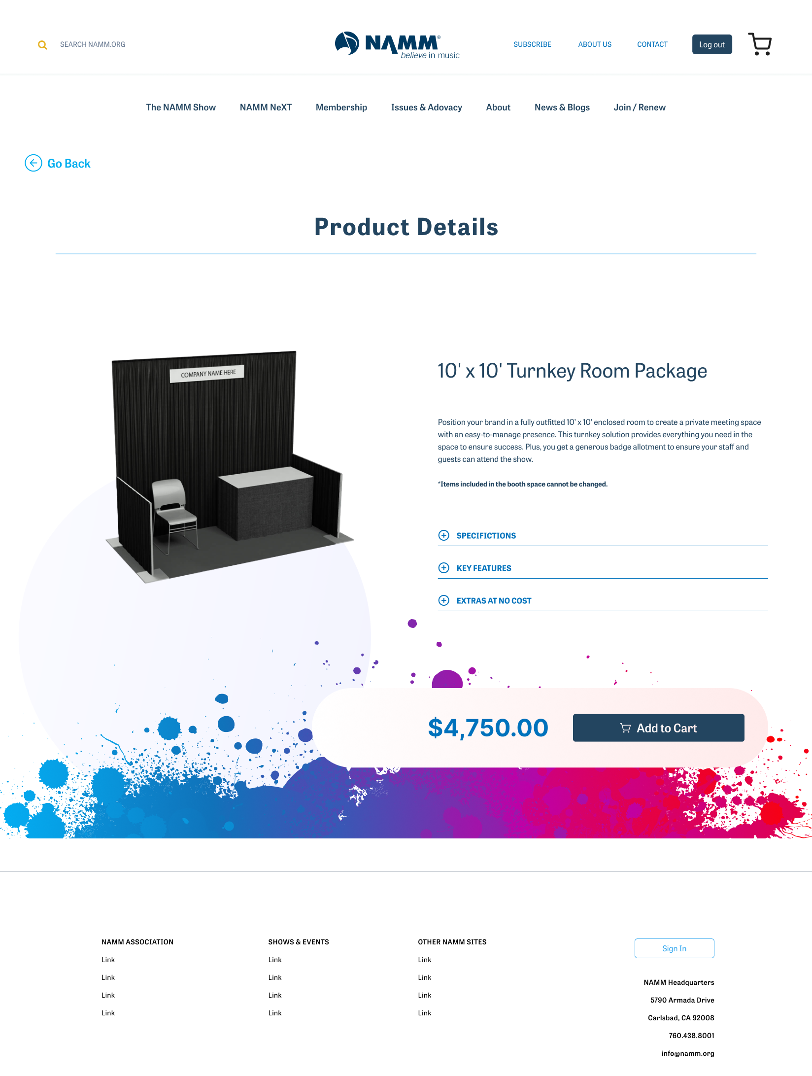
The shipped product page replaced the old landing page's placeholder video and generic copy with an actual booth render, expandable specification sections, and a persistent price and cart bar. The final visual layer carries NAMM's brand identity end to end, built on a design token system inspired by Tailwind CSS's utility-first conventions for consistency across desktop and mobile.
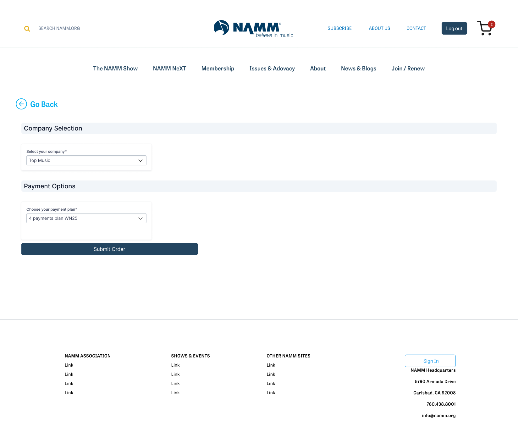
Confirmation offers hotel and visa help right where the user lands — instead of making them go find that page themselves.
View the final exhibitor workflow in Figma →Auditing the live site before redesigning it meant every change traced back to a specific, documented problem — not a guess. Unifying the workflow, surfacing membership requirements early, and reordering the page hierarchy cut the time exhibitors spent completing their purchase in half. That work ran alongside a broader NAMM redesign effort, during which overall customer retention rose 10% — this flow's direct, measured contribution is the time-on-site drop above.
Looking back: not having direct access to exhibiting musicians is the one constraint I'd push back on harder today. The debriefs from NAMM's product owner were enough to find and fix three real problems, but secondhand findings can't surface what a moderated session would — the question a user can't articulate until you watch them get stuck. The audit caught what was broken; I would still have preferred to watch it break myself.