Quiet Platforms is a B2B SaaS platform running logistics and fulfillment for e-commerce and retail brands. Ask a simple question about a partner, and you'd likely get four different answers from four different systems: invoicing, the partner portal, WMS, and transportation. Customer Master is the 0-to-1 feature I designed so business, product, customer service, and support could finally see everything about a partner in one place.
I work as a Senior User Experience Designer & Product Designer at Insight Global, on the Quiet Platforms account. Customer Master didn't exist: this is a 0-to-1 project. I own product strategy, research, information architecture, and interaction design from day one.
I also actively decided what stayed out of the MVP: certain shipping configurations and site IDs got deferred so they wouldn't block the first release.
We needed to iterate quickly in demo meetings and UX workshops. Figma Make handled quick, low-fi concepts early on as our live workshop editor; Claude handled UX strategy, documenting the process, basic code output, and higher-fidelity prototypes for stakeholder checkpoints.
AI handled the fast prototype hand-off. I set the criteria: what it documented, which design tweaks to make, and kept it consistent with the real Figma files.
I took one of the concepts AI generated and made specific, heavy tweaks until it became the most feasible solution for Customer Master. The exploration worked, but it still needed a human touch.
Customer Master worked, but as a human + AI collaboration, not as something AI designed on its own.
"Customer master data" is supposed to be a company's single, authoritative record of a customer, one every other system defers to. Quiet Platforms didn't have one: each partner's information lived scattered across invoicing, the partner portal, the WMS, and transportation, and sometimes only in the signed contract. Nobody could confidently answer a simple question about a partner without hunting for it.
Updating a partner's information had no clear owner or process, so changes often didn't reach every team that needed them.
Basic account questions took longer than they should have to resolve, because whoever answered was reading from whatever system they had access to, not a shared record, or had to go reread the contract.
Before designing anything, I looked at how established companies solve a single, governed record of customer data. Each one had at least one of three things QP didn't: a dedicated role, a data-governance program, or a platform built for it.
Manages global consumer and industrial data through a dedicated role: Customer Master Data Specialists, people whose job is explicitly to own and maintain this information.
Runs a formal "Customer Master Data & Governance" program to keep data streams clean, governance as a process, not just a role.
Companies like Amazon, Walmart, and multinational manufacturers rely heavily on master-data platforms (such as Informatica, SAP, or Boomi DataHub) to maintain unified customer records.
Before I could design a single screen, I needed to know what partner information existed, where it lived, and who needed it, so I ran sessions with business, product, invoicing, and support.
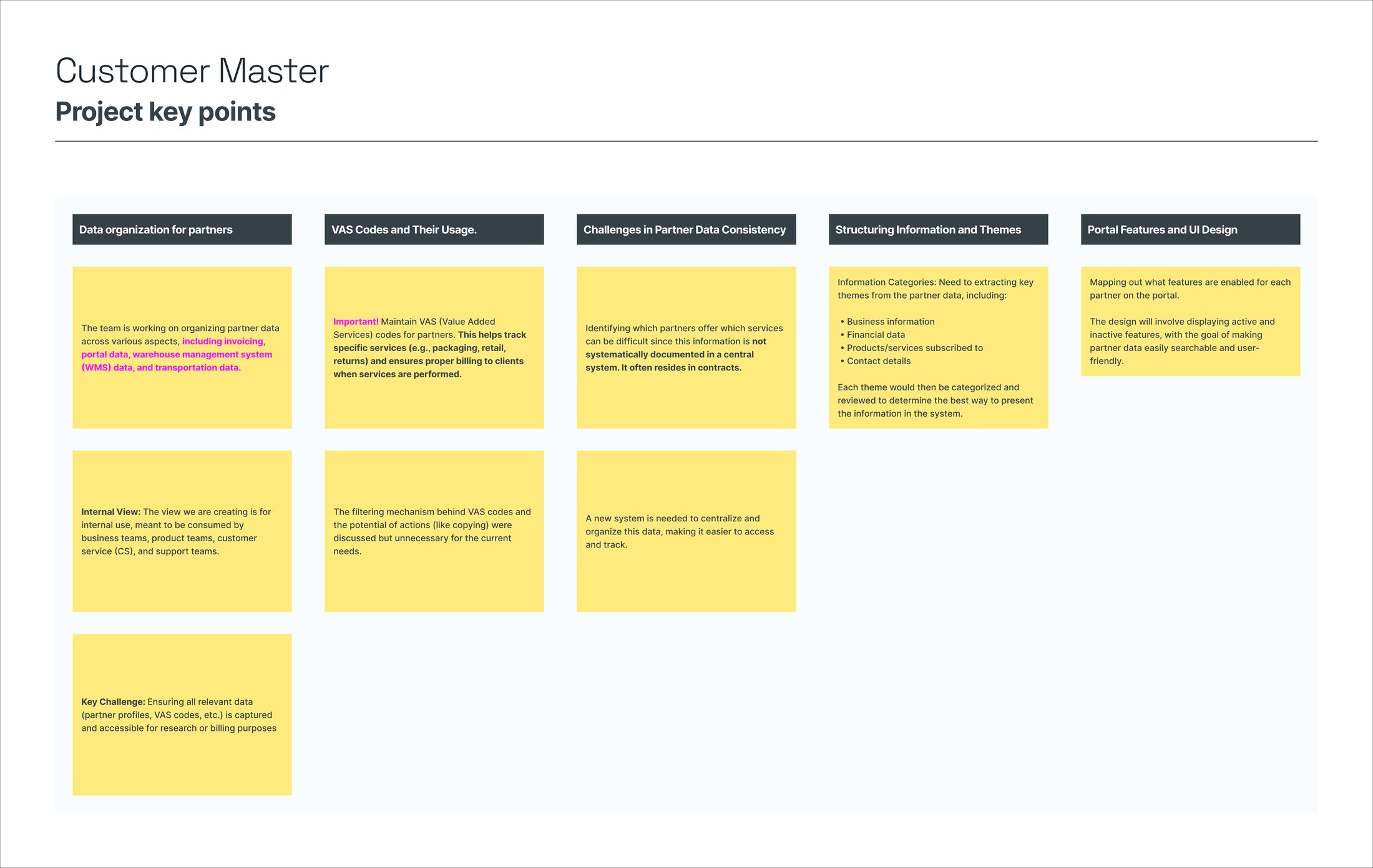
Synthesis from the discovery sessions: how partner data is organized today, and where information only lived in contracts.
Which services a partner offered was hard to track: it often only lived in the signed contract, not any system.
An internal view for business, product, customer service, and support, each needing a different slice of the same partner information.
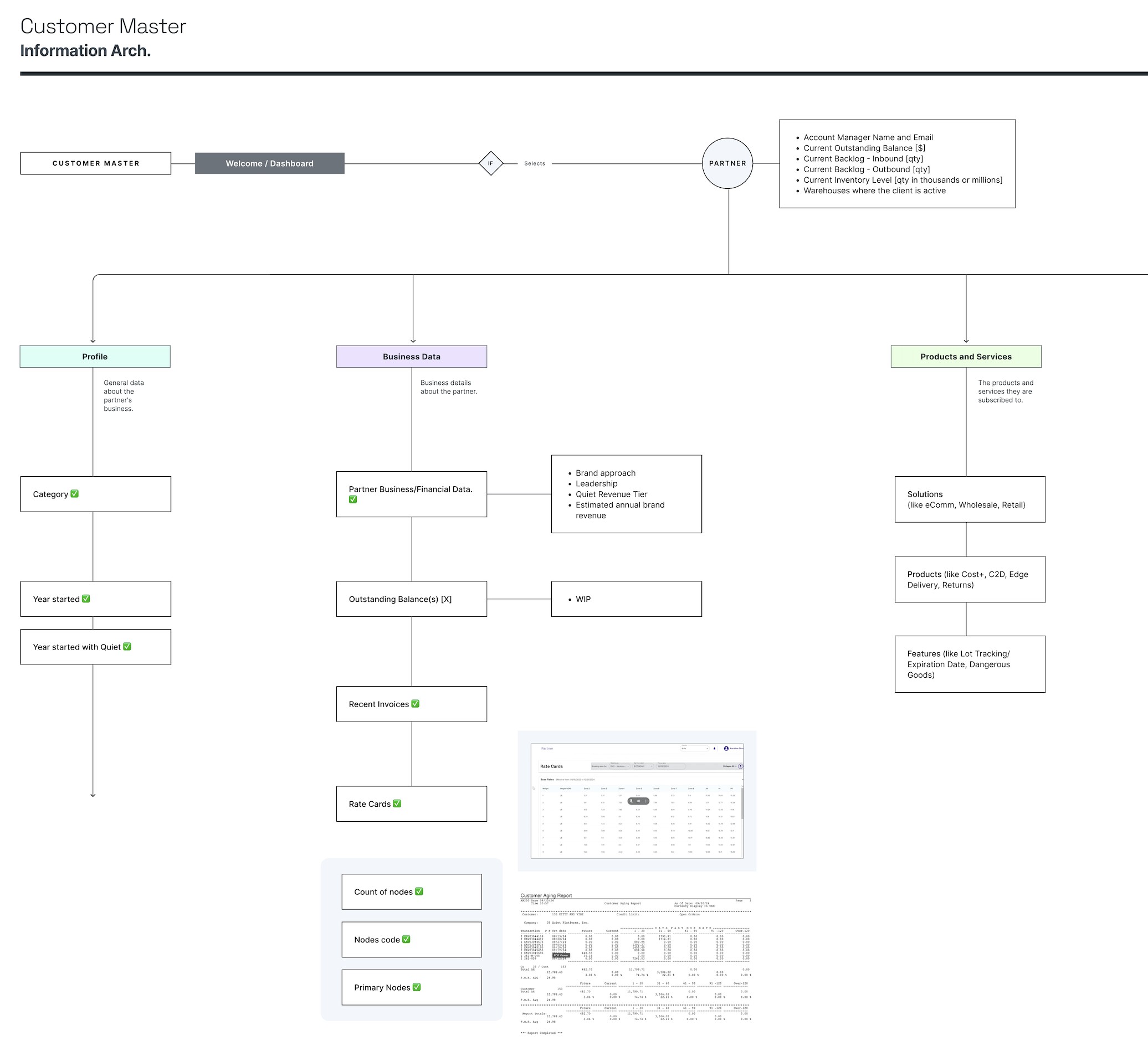
With no existing system to build from, I started with a single central Partner record: the fields any team would need at a glance, like outstanding balance, backlog, and inventory level. Everything else branches out from there.
I grouped the scattered data into six branches, each defined field by field from the discovery sessions.
Partner category, year started, and whether they started with Quiet.
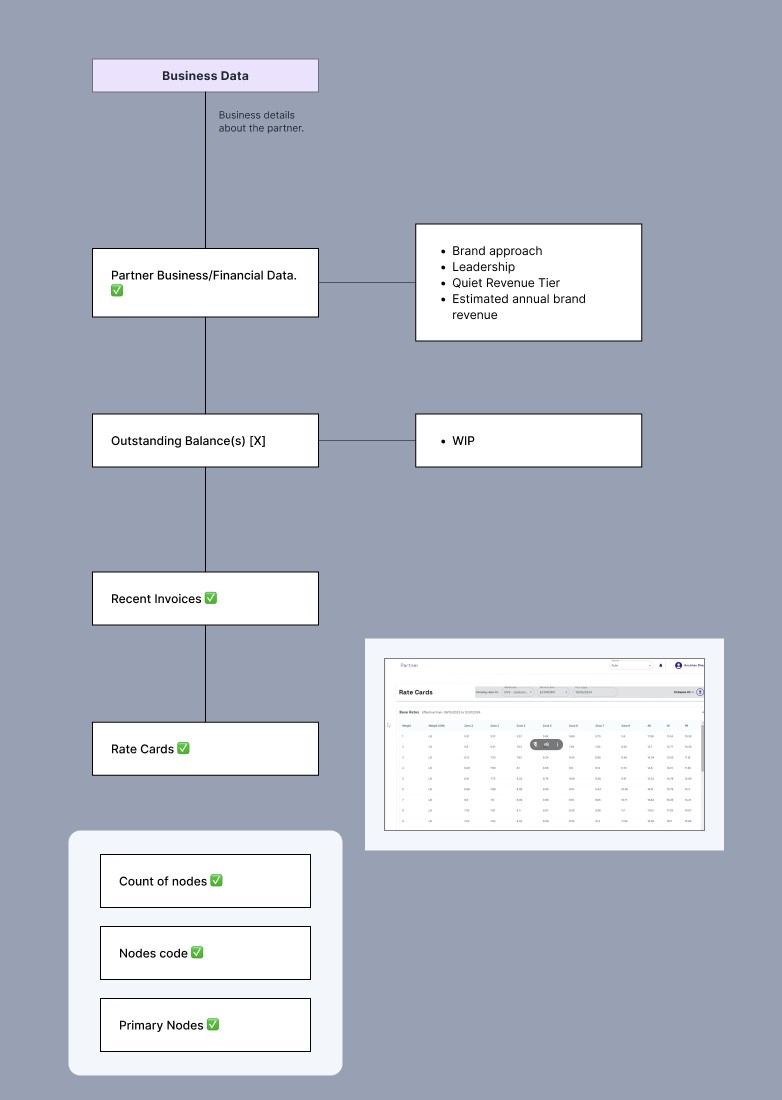
Brand approach, revenue, outstanding balance, recent invoices, and the partner's warehouses.
Which solutions they've subscribed to, which products they use, and which features are enabled.
Portal permissions, and which integrator, OMS, and e-commerce platform each partner runs on.
Carrier-specific logic: the branch that depended most on being defined live with operations, with no existing standard.
Package types by channel, each with its own process, plus VAS codes and warehouse configuration.
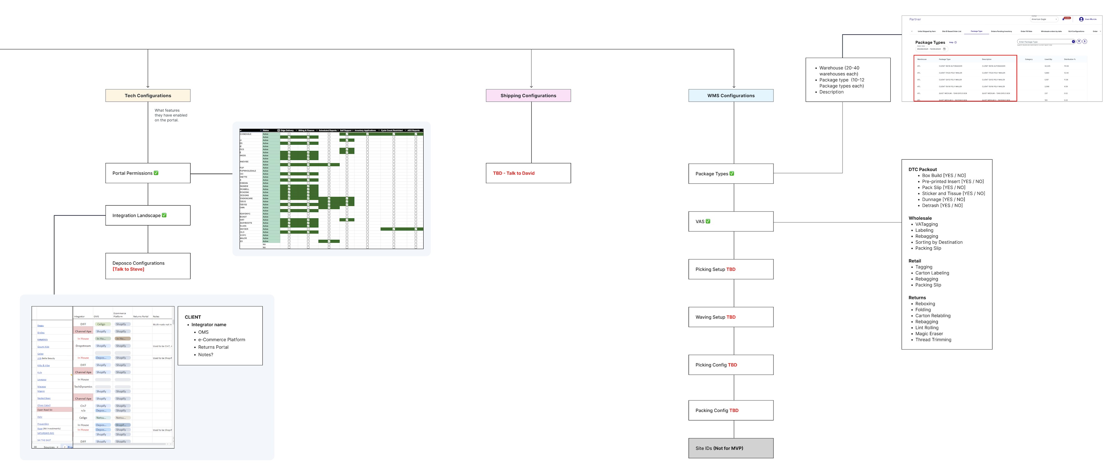
The full map: from the Partner record to the six branches, field by field.
The Business Data branch, expanded field by field.
The Tech, Shipping, and WMS Configurations branches, with what was still TBD marked in red.
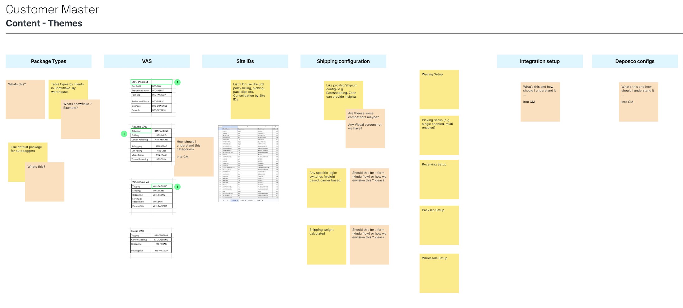
Each branch needed to resolve into actual content before a single wireframe: what a package type is, how VAS codes get grouped, what to do with Site IDs. I organized this into content themes with their open questions.
Content themes by branch, each with its own open questions.
Operations needed more than a read-only view: editing a partner's information directly, and controlling with real granularity who could see certain features.
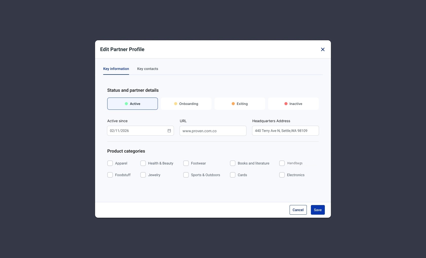
Anyone with access could update a partner's status, product categories, or contact details from Customer Master, instead of asking someone else to change it in whatever system owned that field.
Editing a partner's profile: status, basic details, and categories, from a single modal.
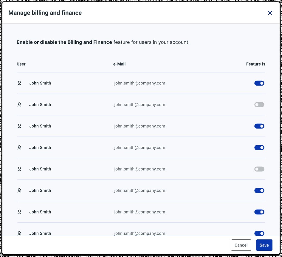
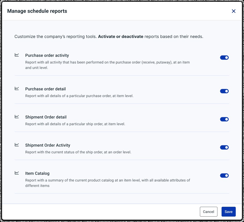
Turning on a feature wasn't a simple on/off switch: switching on Billing & Finance surfaced the partner's full user list to choose who got access; Scheduled Reports worked the same way, per report.
Per-user control: who can see Billing & Finance.
The same pattern applied to Scheduled Reports: activate or deactivate each of the seven reports.
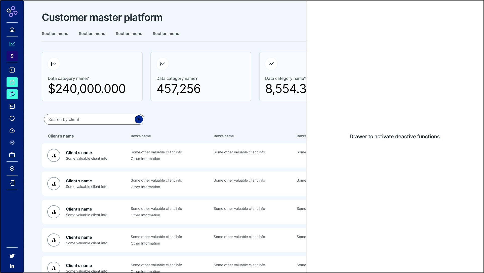
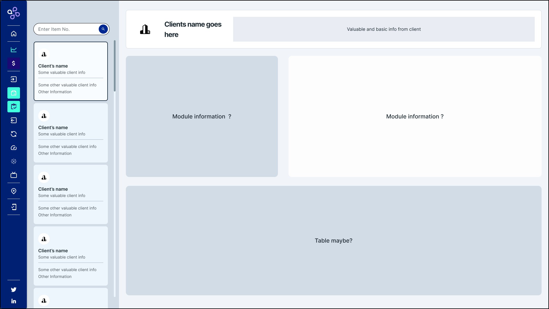
Before any high fidelity, I explored structure with empty boxes and literal placeholder questions, "module information?", to agree on layout before investing time in real content.
Skeleton of the landing screen: cards, a client table, and a drawer to activate functions.
Skeleton of a single partner's overview, before deciding what went in each box.
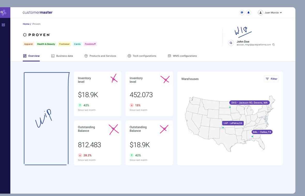
One step closer: crossing out which metric cards were redundant.
No lab study. Validation happened through workshops with the product team during discovery, plus demo sessions where ops, customer service, and finance reacted to what was actually being built. One of those reactions changed the design.
The Exploration skeletons went in front of ops, customer service, and finance to confirm the layout before any screen moved to high fidelity. That sign-off is what the rest got built on.
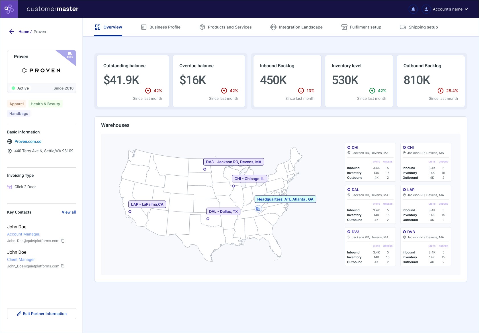
The first overview put the map front and center, with metrics secondary. In the demo, that didn't land: stakeholders wanted the numbers up top, with the map supporting them. That pushback is why the shipped overview looks the way it does below.
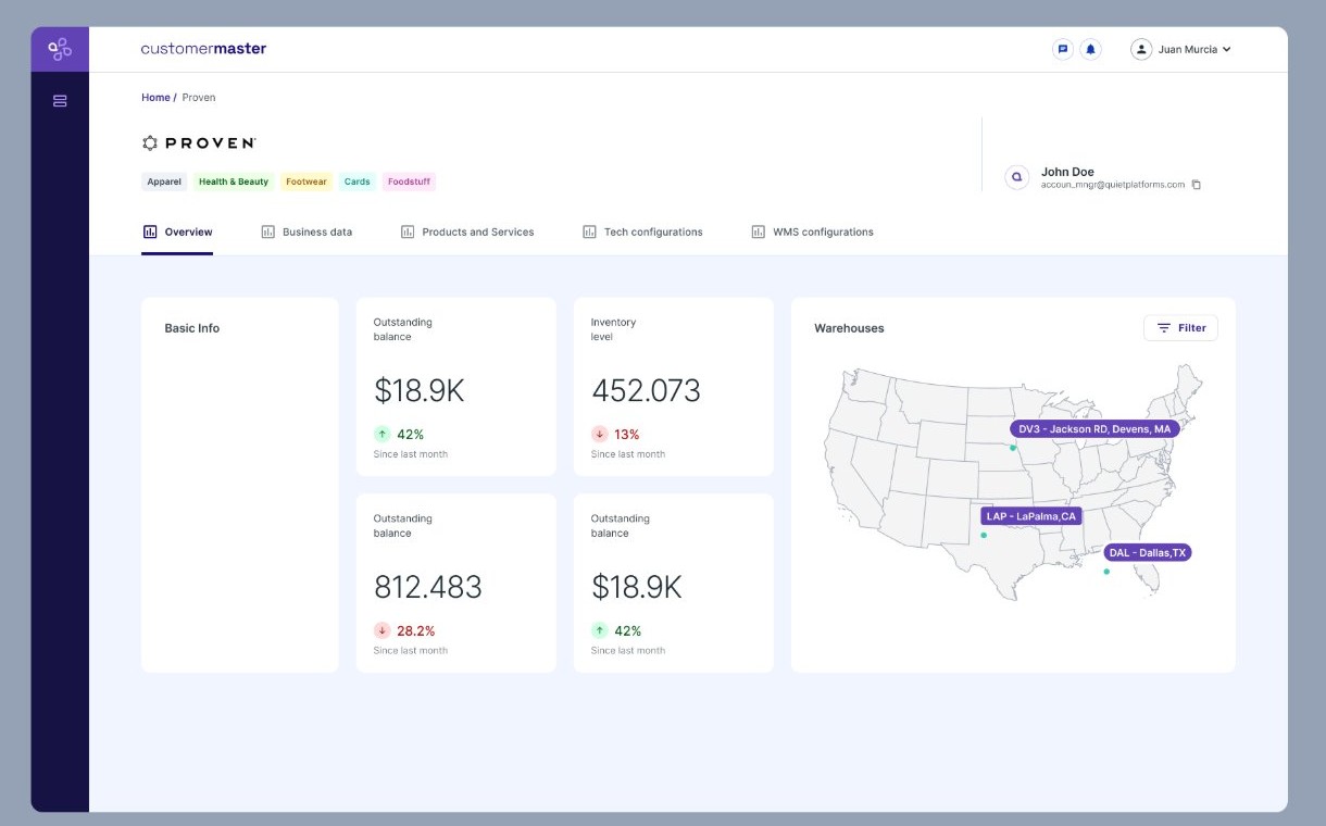
The full Customer Master was too much for a first release, so the MVP was scoped down to a single screen: the overview, with balance, inventory, and a live map of the partner's warehouses. Everything else got built after.
Partner overview: basic info, outstanding balance, and inventory level in a single screen.
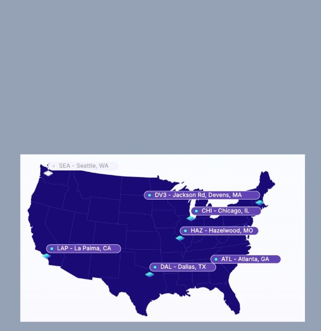
Warehouse visibility: which facilities a partner is active in, at a glance.
That first version is what got demoed, and the map-first layout didn't land. The next iteration merged both panels, moved the metrics to the top, and pushed warehouse-level detail into the map itself.
The final version: metrics up top, and the map carrying inbound, inventory, and outbound per warehouse.
View interactive prototype in Figma →The overview answers "how is this partner doing right now?" The five remaining branches got built afterward as separate tabs, each for a different team: finance needs Business Profile, operations needs Products and Services, tech needs Integration Landscape, the warehouse needs Fulfilment setup.
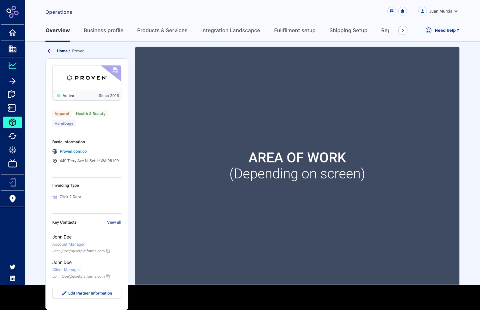
The tab structure, defined before any of them had real content.
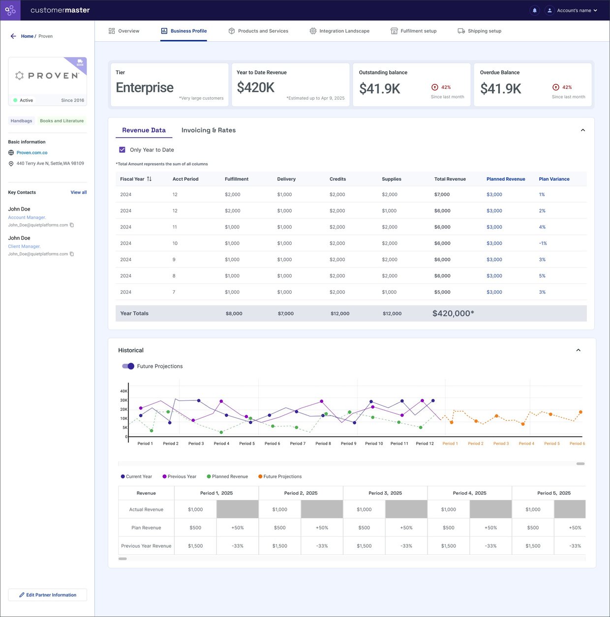
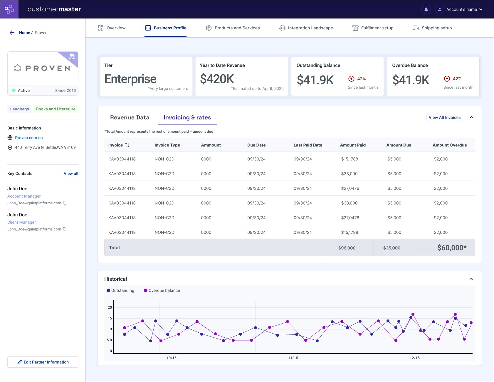
Split into two: Revenue Data, with revenue by period and projections; and Invoicing & Rates, with every invoice and the historical outstanding and overdue balance.
Revenue Data: revenue by period, variance, and projections. Invoicing & Rates is the second tab.
Invoicing & Rates: every invoice, its amounts, and the historical outstanding-versus-overdue balance.
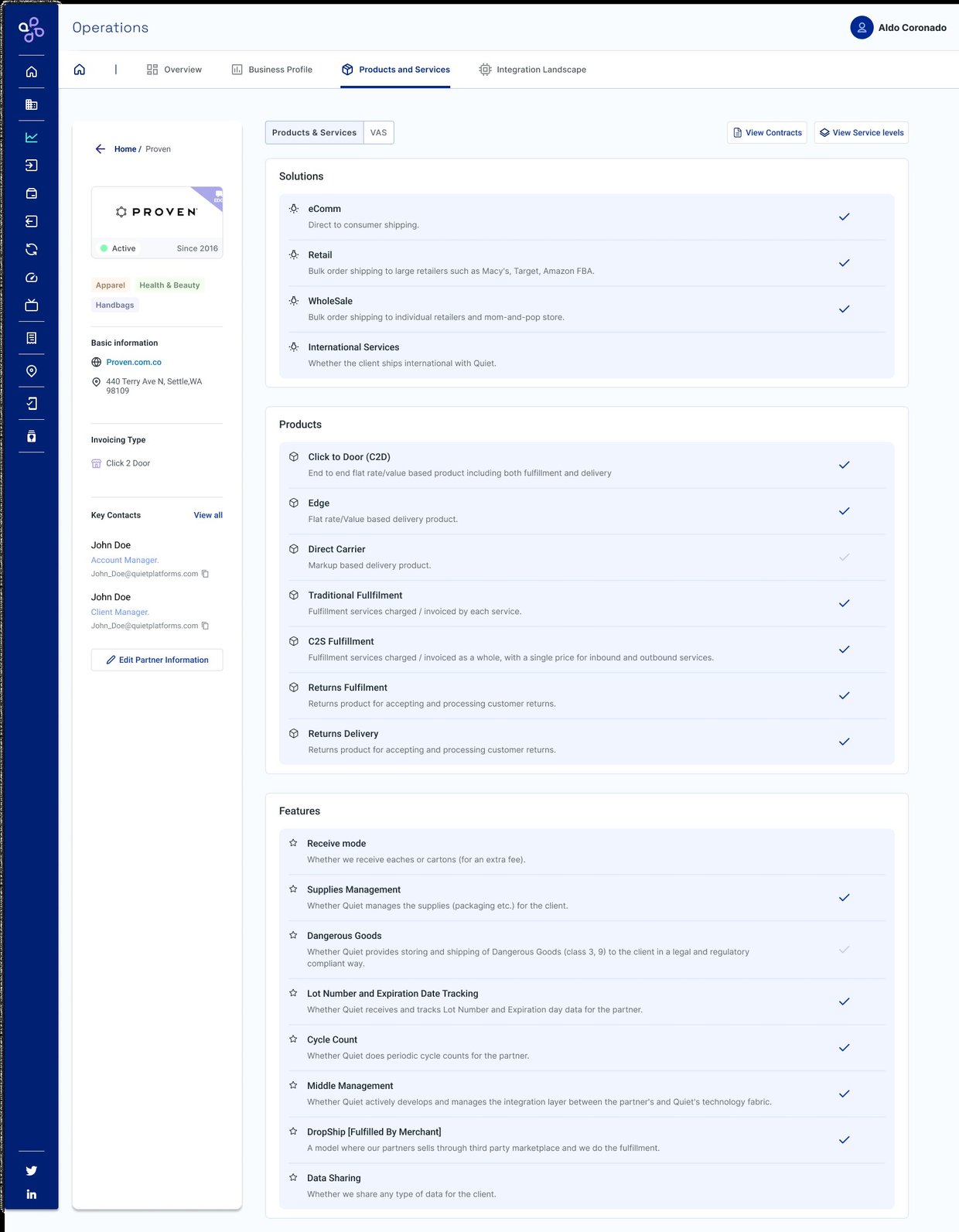
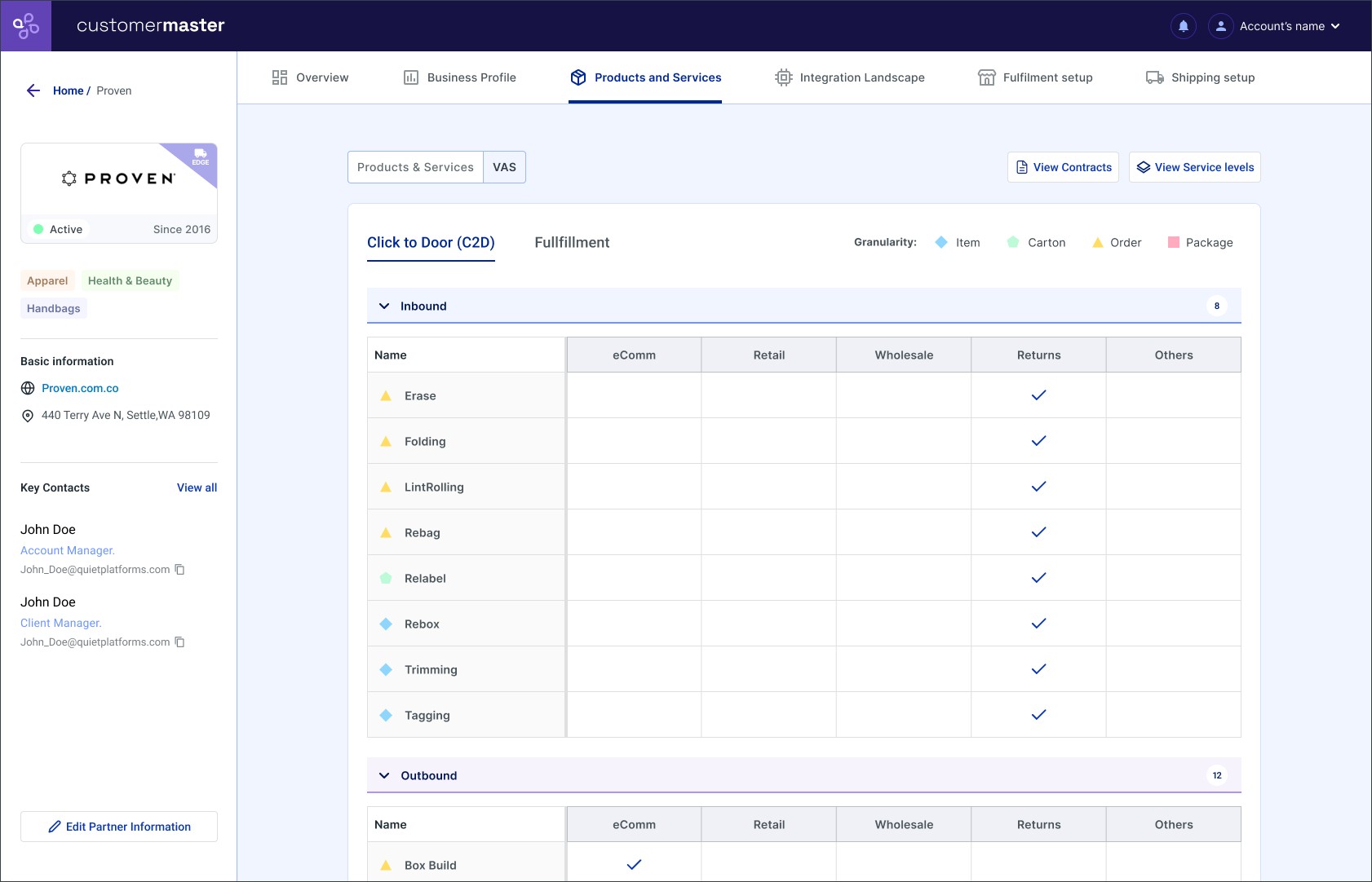
View the new Revenue & Data View prototype in Figma →Which solutions, products, and features a partner has, and separately, the VAS matrix by warehouse and direction.
Solutions, products, and features enabled. Alongside it lives the VAS matrix.
The VAS matrix: value-added services grouped by Inbound and Outbound, checked off by channel and granularity (item, carton, order, or package).
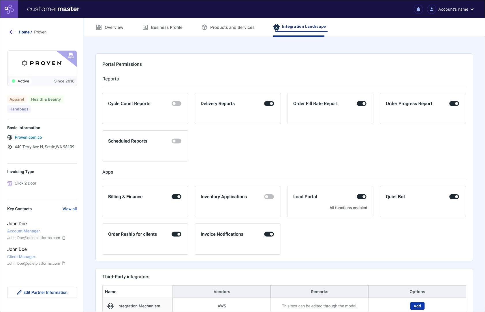
Portal permissions and the list of third-party integrators a partner runs on, from one place, without asking the tech team.
Portal permissions and the third-party integration landscape.
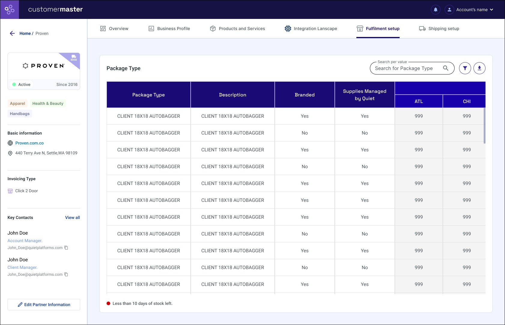
Package types by warehouse, whether they're branded, and current stock, the same information that used to live only in a separate spreadsheet.
Package types by warehouse, with real-time stock.
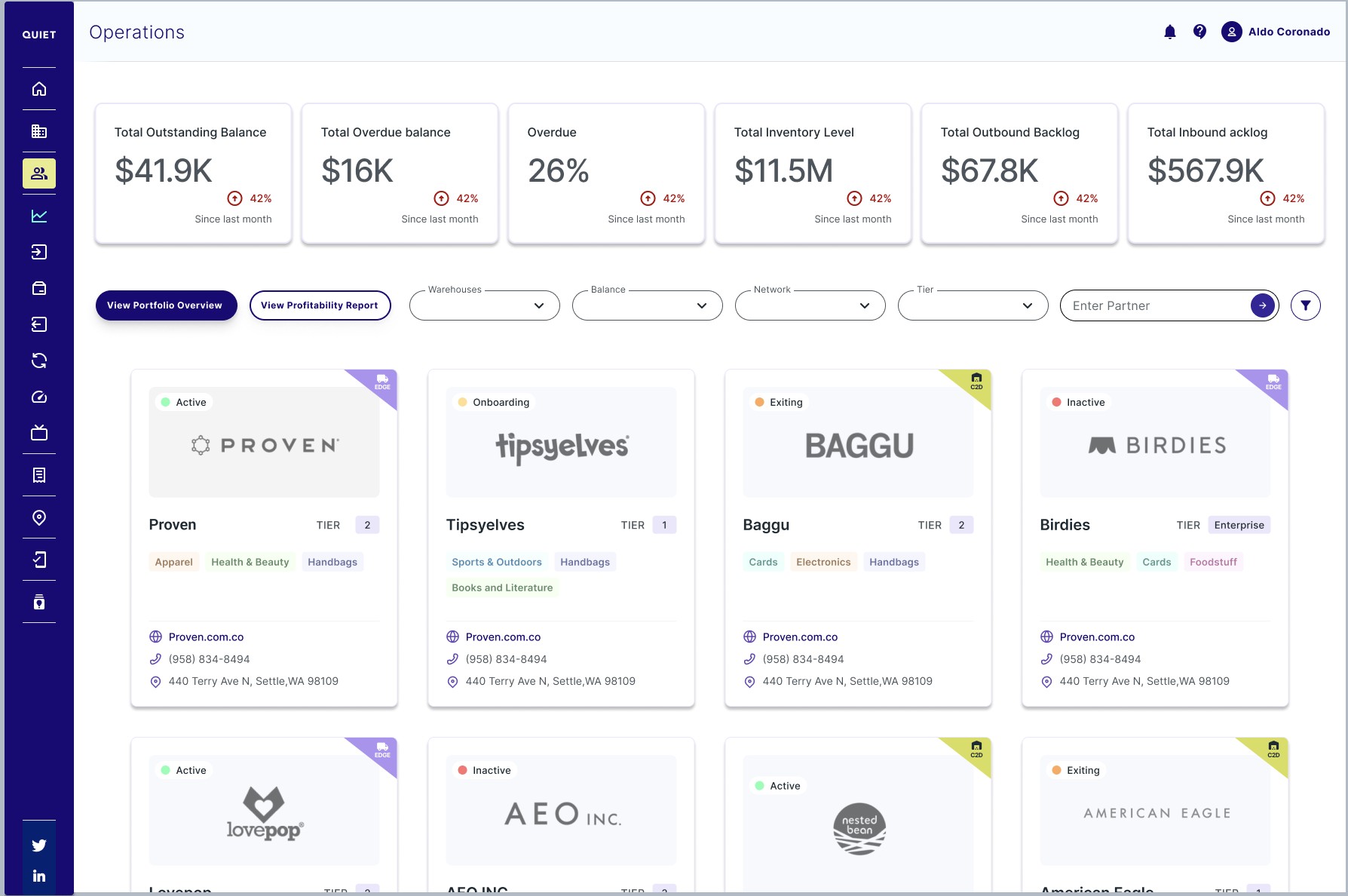
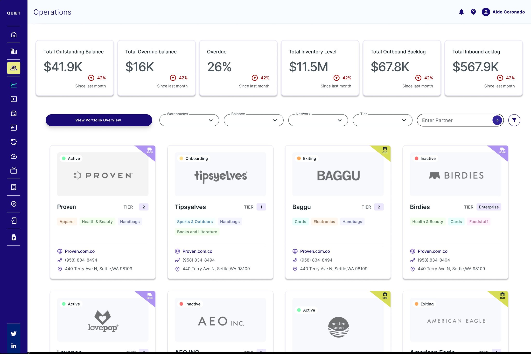
Customer Master didn't stay a single-partner screen. It grew into the operations directory, with the same core metrics rolled up across the portfolio at the top. From there, "View Portfolio Overview" aggregates that same data across every partner, only possible because each one already lived in the same shape.
The partner directory: portfolio-wide metrics up top, and direct access into the Portfolio Overview.
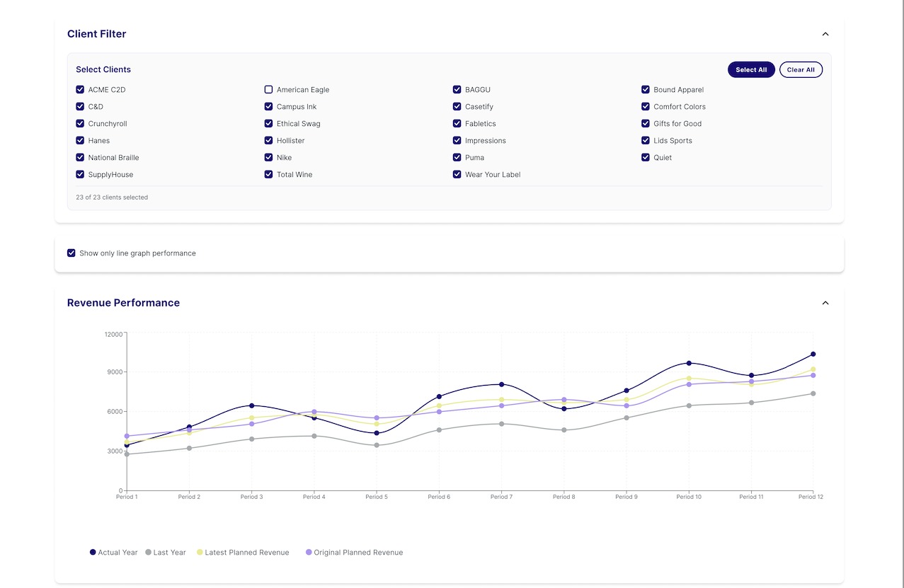
A filter lets you choose which of the 23 partners to include, and the same question Business Profile answered for one partner, how's revenue against plan, gets answered for the whole portfolio.
Client filter and aggregate revenue performance across the selected portfolio.
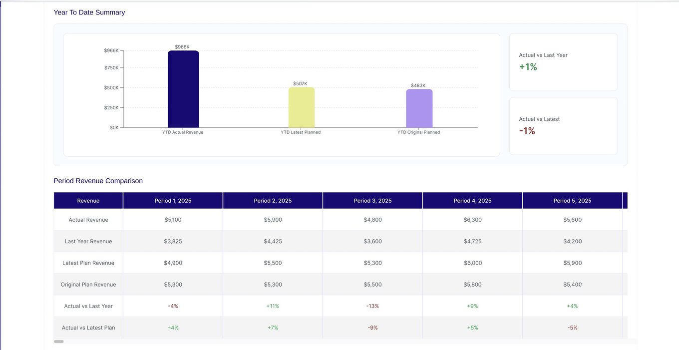
Below each chart, a "Year to Date" summary compares actuals against plan, and a table breaks that comparison down by period. The same pattern repeats for Outbound and Inbound Units.
YTD summary and period-by-period comparison, with the exact variance percentage.
Centralizing partner data meant teams stopped hunting for the same information across four systems. Comparing analytics from the 8–10 weeks after the MVP against the period before, support tickets dropped an estimated 15%, and internal adoption grew an estimated 10%. Both come from real analytics, but they're still an early directional read, not an audited measurement.